Heritage · Art history
The Art of the Citrus Crate Label
From 1885 to 1955, California's citrus groves produced some of the finest commercial lithography in American history — bold colors, idealized landscapes, and orange groves under perpetual golden skies. The crate label is California's forgotten art movement.
Before the supermarket shelf, before the branded produce bag, before the sticker on your navel orange, there was the crate. And on the end of every wooden crate — stacked by the thousands in refrigerated rail cars rolling west to east across the continent — was a label so vivid, so carefully composed, that it amounted to a full-throated argument for a place. California as it wanted to be seen. California as it sold itself to the world.
Between roughly 1885 and 1955, the state’s citrus growers commissioned more than eight thousand distinct label designs. Most measured just ten inches by eleven. Nearly all were printed in a riot of twelve to sixteen colors. Taken together, they constitute one of the most sustained campaigns of commercial image-making in American history — and one of the least remembered.
Ink on Stone
The technology that made it possible was chromolithography, a printing process that required artisans to draw each color separately onto a flat limestone slab, layer the impressions in precise registration, and produce — after weeks of skilled labor — a sheet of paper that blazed with color unavailable in any other print medium of the era. The process had reached California by the 1880s, carried by European craftsmen who found steady employment in San Francisco’s booming print trade.
The dominant houses were concentrated in those two cities. Schmidt Lithograph Company in San Francisco, founded in 1881, became one of the largest chromolithography operations on the West Coast, producing labels for growers across the San Joaquin and Inland Empire. Western Lithograph Company in Los Angeles grew to serve the southern California market, its presses running through the citrus boom years without pause. Stecher-Traung, originally a Rochester firm, opened a California operation to capture the expanding business. The California Fruit Exchange — the cooperative grower organization that would eventually launch the Sunkist brand — developed its own printing relationships to manage the visual identity of member growers at scale.
The shift from hand-drawn stone plates to photomechanical reproduction began around 1900 and accelerated through the 1910s. Photographic transfers onto zinc and aluminum plates reduced the hand labor required per run and allowed for more photographic precision in rendering landscapes and faces. But the essential aesthetic — saturated color, bold outline, the imperative brightness of a label competing against dozens of others in a warehouse or produce stall — survived the technological transition entirely intact.
The Visual Language of Somewhere Perfect
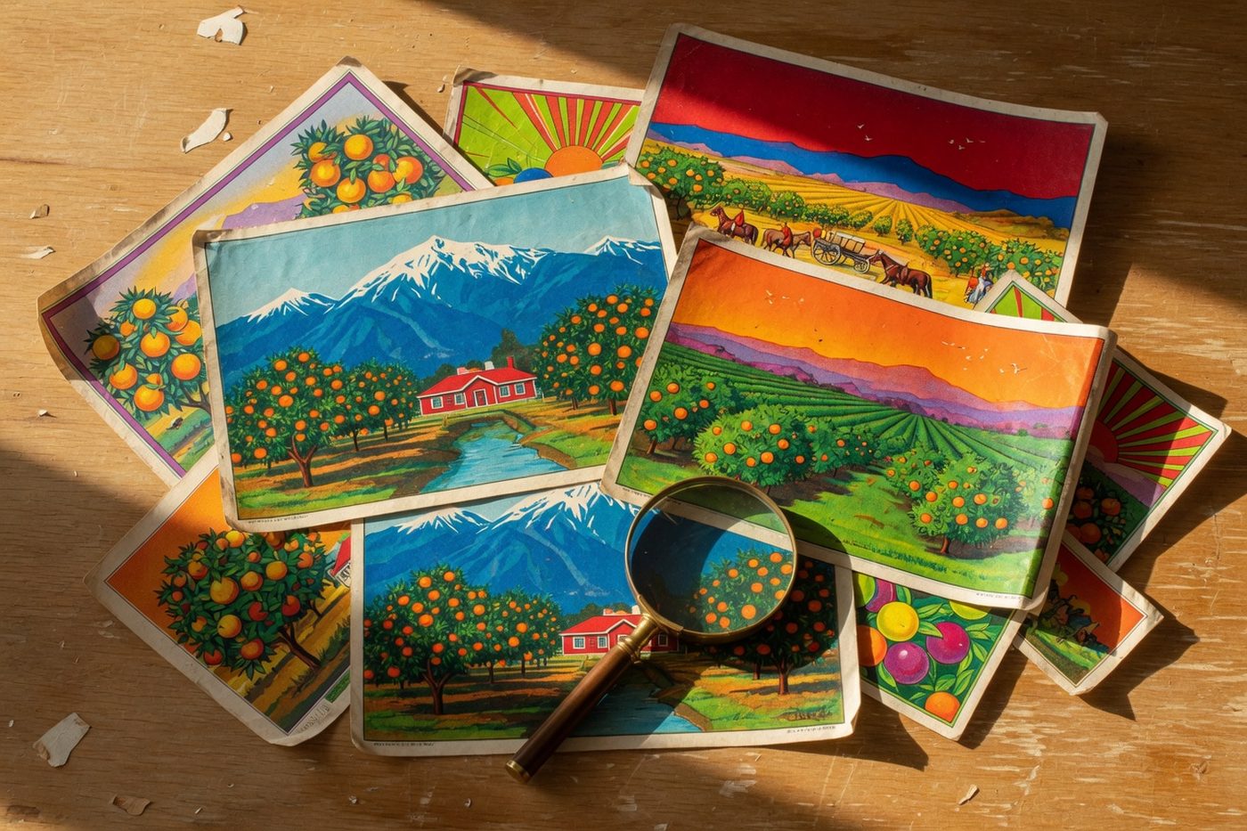
What did these labels show? Almost invariably: an idealized version of where the fruit came from, or where the grower wished it came from, or where the buyer dreamed of being.
The vocabulary was consistent and knowing. Snow-capped mountains rose behind orange groves that were always in full fruit and full blossom simultaneously — a botanical impossibility that no one seemed to mind. Spanish mission arches framed sunlit courtyards. Beautiful women in white dresses held blossoms to their faces. Native American figures appeared in full regalia on labels from Riverside and San Bernardino counties, lending an air of romantic antiquity to operations that were, in truth, thoroughly modern agricultural enterprises. Local landmarks anchored regional identity: the arrowhead rock formation visible on the San Bernardino Mountain slope above Waterman Canyon inspired dozens of Inland Empire brands; the profile of Mount Baldy appeared on labels from the San Gabriel Valley foothills.
The growers understood something that modern brand strategists would recognize immediately: they were not selling citrus. They were selling California. Their buyers in Chicago, New York, and Boston had almost certainly never visited. The label was the entire experience of origin. It needed to be aspirational, specific, and impossible to ignore at twenty feet.
Consider the “Arrowhead Brand,” produced for a San Bernardino County grower in the 1920s: the label centered on that famous pale formation against a dark chaparral hillside, with a foreground of heavy-laden orange trees and the low roofline of a ranch house suggesting prosperity without ostentation. The typography was set in a strong serif face, the brand name arched over the image in deep burgundy. It communicated, in approximately one square foot of printed paper, an entire mythology of Southern California ranching life.
Or “Valencia Queen,” issued by a Riverside-area grower specializing in the variety that had made the region famous. The central figure was a young woman crowned in orange blossoms — the queen of the title — her expression serene and her background a grove receding into warm afternoon light. The University of California Citrus Variety Collection at Riverside still maintains living specimens of the original Valencia trees that drove this economy; the label suggests how seriously growers took the variety’s identity as a marketing asset.
The Label as the Brand
The economics of the system placed unusual weight on that small rectangle of paper. Most citrus growers operated under cooperative arrangements or sold through brokers; by the time their fruit reached a retail buyer, the grower’s name had usually disappeared from the transaction. The label — visible to produce buyers at the packing house, to wholesale buyers at the terminal market, to retail merchants stacking crates — was often the only consumer-facing identity a ranch ever possessed.
This is why the designs were so lavish, and why the investment was so serious. Limoneira Company in Santa Paula, one of the oldest continuously operating citrus ranches in California, maintained a distinct visual identity across decades of label production. Blue Goose, a brand used by Mutual Orange Distributors, became recognizable across the national wholesale network. Sunkist, the California Fruit Exchange’s consumer brand launched in 1908, was one of the first agricultural cooperatives to pursue national consumer advertising — and the crate label was part of a coordinated visual system long before that term existed in marketing.
The USDA’s National Agricultural Library and UC ANR have both documented the sophistication of this early agricultural branding; what emerges is a picture of growers and their cooperative organizations making deliberate, expensive, competitive decisions about visual identity in a market where the label was the only handshake a grower ever got with the buyer.
The Overnight Disappearance
The end came quickly, and without ceremony. During World War II, cardboard boxes replaced wooden crates in many sectors as lumber was redirected to the war effort. After the war, the cardboard box was cheaper, lighter, and easier to handle — and it did not need a label glued to its end panel. By the early 1950s, the lithography houses that had spent seventy years perfecting the California crate label had largely pivoted to other work. By 1955, the form was essentially dead.
The labels themselves survived by accident. Some growers kept overruns. Packing house workers took bundles home. Label brokers acquired stock from closing print houses. For decades these collections sat in garages and attics, slowly gaining the recognition that eluded them when they were merely packaging.
What Survives
The collecting market today ranges from modest to serious: common labels in good condition sell for five to twenty dollars; rare or visually exceptional examples from known brands regularly fetch two hundred to five hundred dollars or more at auction and in specialty shops. The interest reflects a belated recognition that these images are primary documents — of California’s self-image, of American commercial art, of a moment when lithography and agriculture briefly produced something neither field could have made alone.
The major institutional collections reward attention. Cal Poly Pomona’s Kellogg Library holds one of the largest single collections in the country, with thousands of labels organized by region, brand, and lithographer, and accessible to researchers and the public. The A.K. Smiley Public Library in Redlands holds a significant collection of Inland Empire labels, preserving the visual history of the San Bernardino County groves that produced some of the form’s most distinctive work.
For those who want to see the originals in context, Redlands’ Label Museum holds more than three thousand original labels and offers one of the most concentrated encounters with this art form available anywhere in Southern California — a quiet archive of a California that was always partly invented, and always entirely believed.